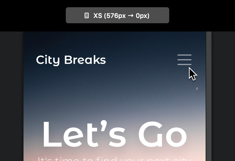
Websites built with Blocs use the Bootstrap framework. When a site that uses Bootstrap is viewed on a mobile device, the standard navigation links become a toggle menu that is accessed via a button, this is normal behaviour as it improves the mobile user experience.
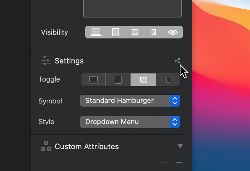
Changing the Toggle Symbol
Bootstrap displays a standard Hamburger symbol ☰ for the toggle menu button, there are times when you may wish to change this to give your site more character. Blocs makes replacing this symbol a very simple process. First select the navigation toggle item by clicking it on the design canvas or if it’s hidden, locate it in the layer tree.
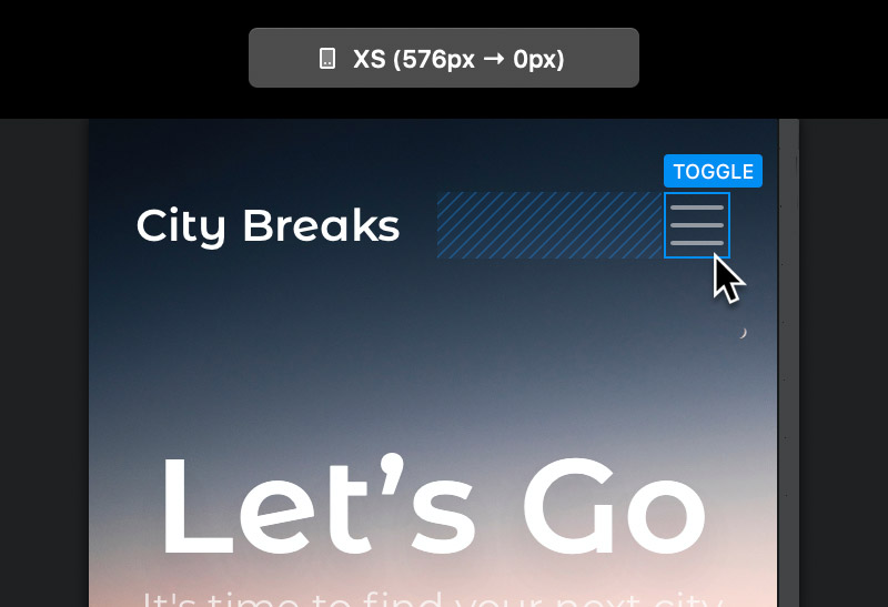
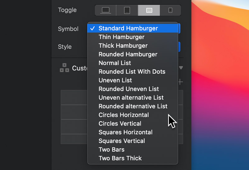
Now in the sidebar inspector options, navigate to the drop down button labelled Symbol, by default this option is set to Standard Hamburger.
Toggle Symbol Colour
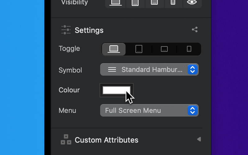
As well as setting the toggle menu symbol style, you can also customise its colour using the colour well, located in the sidebar inspector.
The default colour of the navigation toggle symbol is controlled via the Nav Bar that it is nested within. The Nav Bar Bric allows you to set the navigations theme to either dark or light, this theme refers to the background colour of the Bloc containing the navigation elements. When the dark theme is active the toggle symbol is white and when the light theme is active the toggle symbol is dark.
With the toggle item selected, you can quickly access the parent Nav Bar, using the related elements drop down options located at the right side of the Appearance title.
From here you can set the navigations theme.
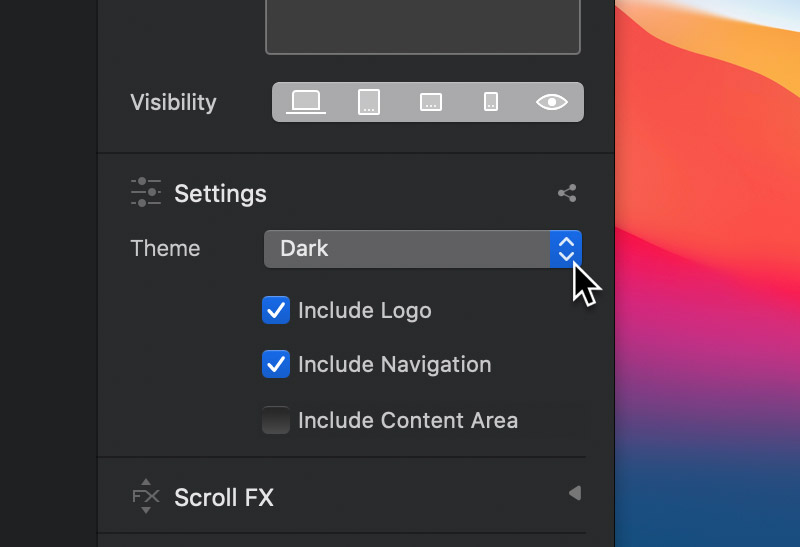
It’s also possible to set the appearance of the toggle menu as well as setting the breakpoint you want it to be visible on.