CSS Grid is a two-dimensional grid-based layout system that allows you to create organised and flexible website layouts. Think of it as a grid of columns and rows that you can use to position and arrange webpage elements. However, unlike HTML tables, CSS Grid layouts are controlled with CSS and not HTML markup. This makes CSS Grid extremely flexible for responsive web design.
How CSS Grid Works in Blocs
When working with CSS Grid within Blocs, it’s important to consider, that the Grid layout is made up of two main elements, a parent grid container and in most cases, multiple inner child containers.
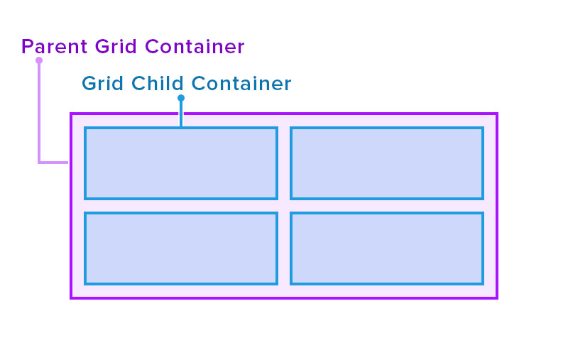
Parent Grid Container
The parent grid container is responsible for the main layout information. For example, the number of columns / rows and their respective gap dimensions apply to this element.
Grid Child Container
The inner child containers are the boxes you would typically place your website interface elements in. By default, these containers are set to auto-flow (fit into the grid), however, they can be customised using custom classes in order to be positioned in a wide variety of ways, within the parent grid container.
You can read more about positioning child containers here.
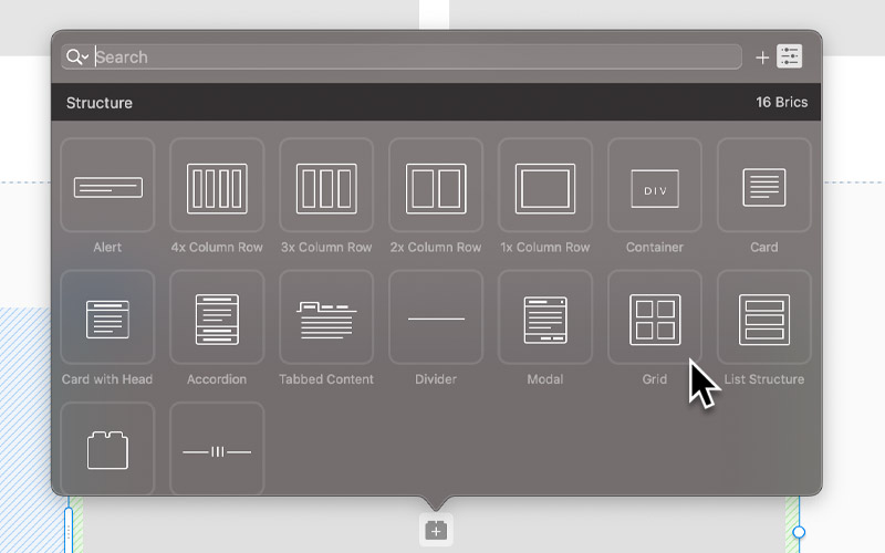
Add a Grid Container
You can begin using CSS Grid in your Blocs project by either adding a CSS Grid container using the dedicated Bric.
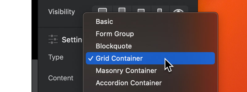
Or alternatively, by selecting a Div Bric and setting its type to Grid Container.
Columns
Columns are the vertical divisions of space in the CSS Grid Layout, they are particularly useful in guiding a viewer’s eye, optimizing readability, and efficiently, utilizing space.
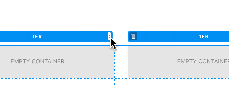
Add a Column
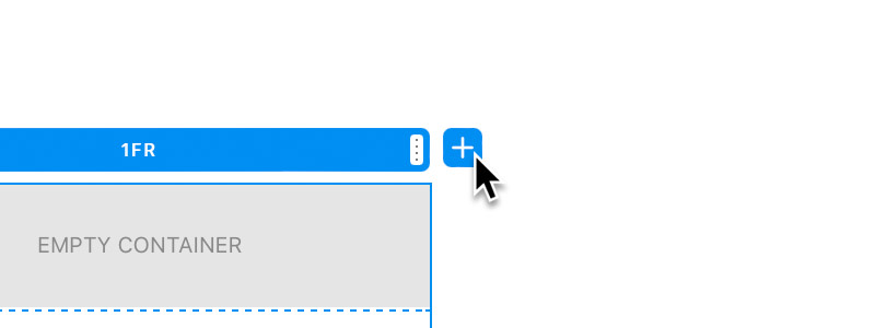
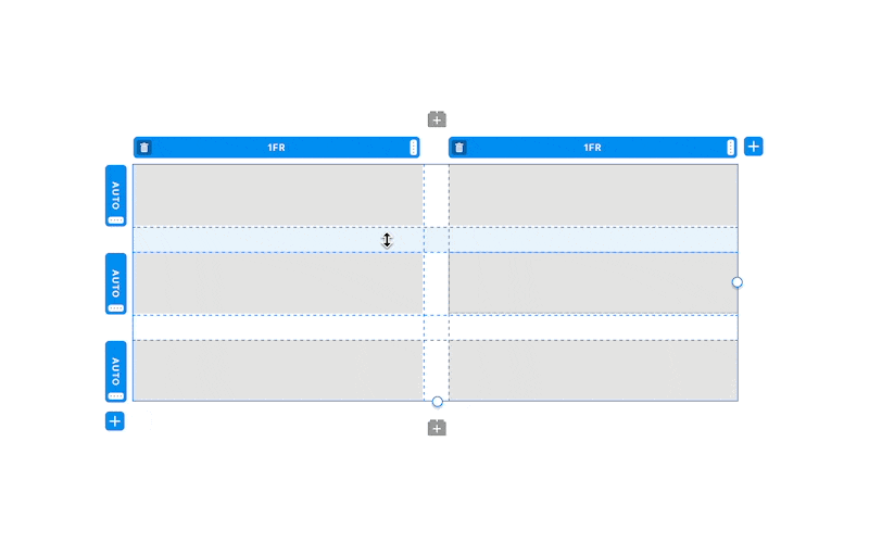
Additional columns can be added to a CSS Grid container by clicking the plus button + located at the top right corner of the Grid selection controls.
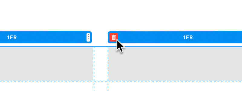
Remove a Column
Columns can be removed from a CSS Grid container by clicking the trash button located at the top left of a column width controller.
Column Width
By default the width of a column is set to 1fr on CSS Grid containers within Blocs. The fr unit stands for fraction. It represents a fraction of the available space in the grid container.
When used for column width, 1fr means that the column will take up one fraction of the total available space. If multiple columns use the fr unit, the space is divided according to each column’s fraction value relative to the sum of all columns’ fraction values.
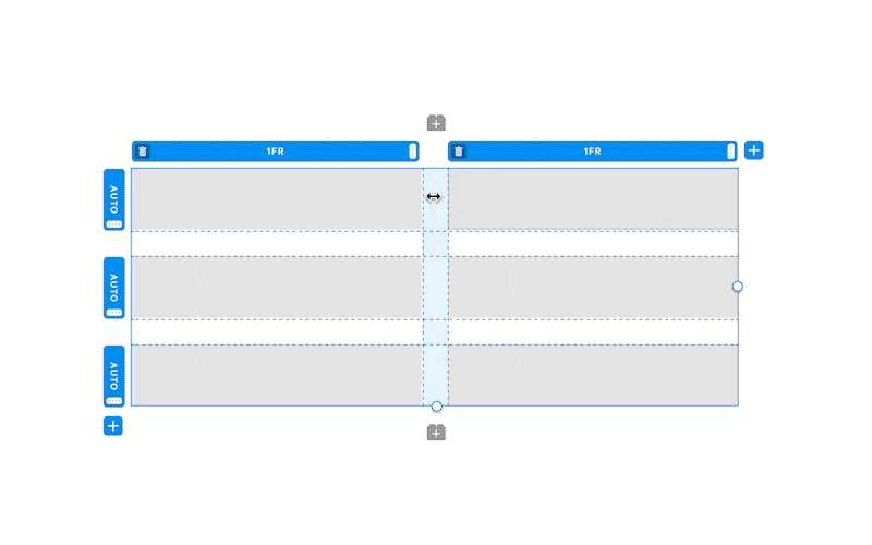
The width of a column can be adjusted per breakpoint using the resize handle found on the column width control. Dragging this handle left or right will adjust the fr value for the related column in increments of 0.5.
Column Gap
You can set the spacing between columns on each breakpoint by dragging in the empty space between the columns within the grid container on the design canvas.
You can also reset the column gap measurement of a CSS Grid container by right clicking in the space between columns and selecting Reset Width.
Rows
Rows are the horizontal divisions of space in the CSS Grid layout, they ensure content flows logically and maintains visual alignment.
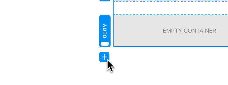
Add a Row
Additional rows can be added to a CSS Grid container by clicking the plus button + located at the bottom left corner of the Grid selection controls.
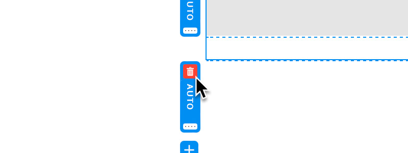
Remove a Row
The process of removing rows is a little different to removing columns. It’s only possible to remove rows when there is a negative number of child containers for the number of rows in the grid layout.
When the child container count is negative for a row, a trash button will be displayed on the top edge of the row height control (that does not have any child containers in it). Clicking this button will remove the row.
Row Height
The default height of a row is set to auto on CSS Grid containers within Blocs. The auto unit essentially tells the grid to automatically determine the height of that row based on its content. In other words, the row will be as tall as the tallest piece of content inside that row’s grid child containers.
The height of a column can be adjusted per breakpoint using the resize handle found on the row height control. Dragging this handle up or down will adjust the row height in pixels.
Although this option is available, it’s recommended to use auto for row heights, as it is more flexible with regard to the responsiveness of the layout.
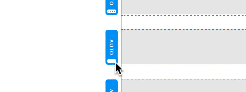
Row Gap
You can set the spacing between rows on each breakpoint by dragging in the empty space between the rows within the CSS Grid container on the design canvas.
You can also reset the row gap measurement of a CSS Grid container by right clicking in the space between columns and selecting Reset Height.
Positioning Child Containers
By default, these containers are set to auto-flow (fit into the grid), however, they can be customised independently using custom classes, in order to be positioned within the parent grid container.
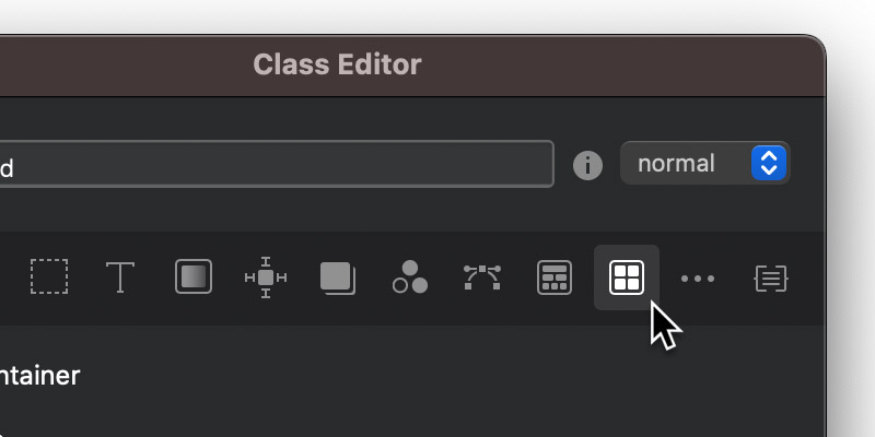
In order to customise how a grid child container is positioned within the grid, you must first select it and apply a custom class.
Using the Class Editor, it’s now possible to apply values to the Grid Item rules for the selected child container in order to position it, in its respective CSS Grid parent container.
Column Start
The grid-column-start property is used to indicate the column grid line where a grid item starts in a grid layout.
Column End
The grid-column-end property is used to indicate how many columns an item will span, or the column grid line where a grid item ends in a grid layout.
Row Start
The grid-row-start property is used to indicate the row grid line where a grid item starts in a grid layout.
Row End
The grid-row-end property is used to indicate how many rows an item will span, or the row line where a grid item ends in a grid layout.
Positioning Techniques
Using the column start, column end, row start and row end properties, it’s possible to position child containers within the CSS Grid parent container. Here are some common examples of grid child positioning techniques.
All examples here can be examined further in this Blocs sample project.
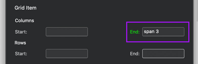
Span Columns
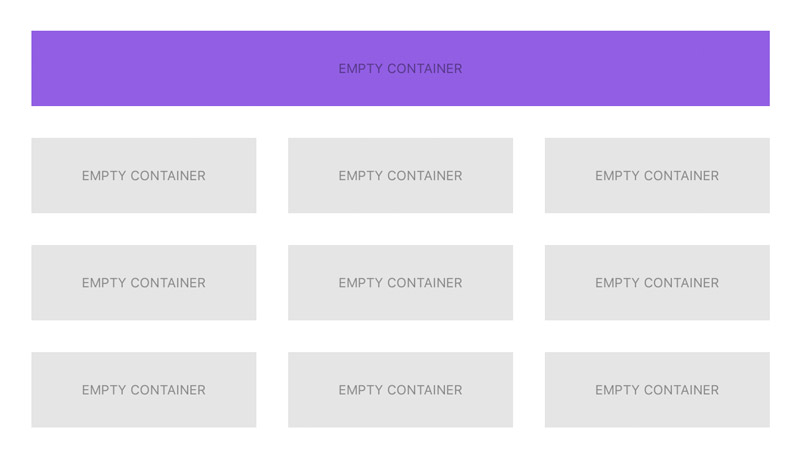
To span a grid child container across a number of columns, apply a class to the child container and then set the Grid Items > Column > End field value to span followed by the number of columns you would like to span the child across.
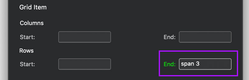
Span Rows
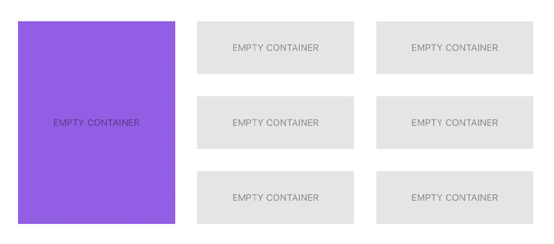
To span a grid child container across a number of rows, apply a class to the child container and then set the Grid Items > Row > End field value to span followed by the number of rows you would like to span the child across.
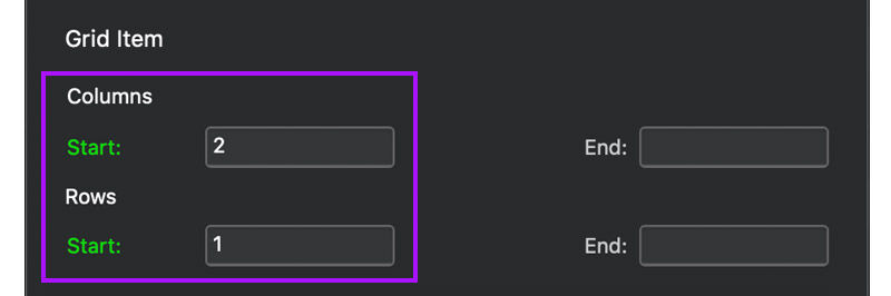
Change Horizontal Position
In this example, the purple child container is originally in the first horizontal position in the grid, using a custom class it’s moved right into the second horizontal position or second column.
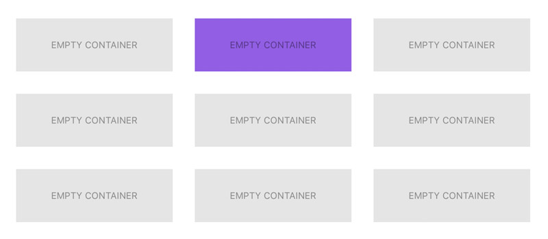
To position a grid child container horizontally, apply a class to the child container and then set the Grid Items > Column > Start field value to the column number you would like to position it in. It’s also important to set the Grid Items > Row > Start field value to the row number you want it to remain in.
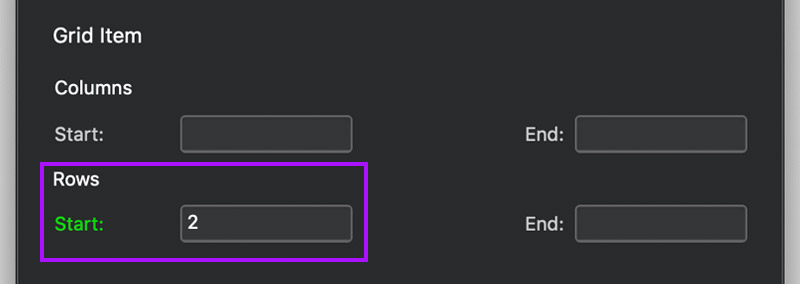
Change Vertical Position
In this example, the purple child container is originally in the first vertical position in the grid, using a custom class it’s moved down into the second vertical position.
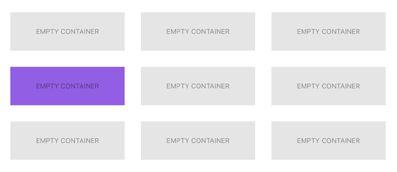
To position a grid child container vertically, apply a class to the child container and then set the Grid Items > Row > Start field value to the row number you would like to position it in.
Further Reading
This article is intended for beginners who are taking their first steps with CSS Grid, if you are looking for more in-depth and advanced information on CSS Grid, we recommend reading this introductory guide on CSS Grid from CSS Tricks.