Most modern web browsers support the ability to run websites in either dark or light mode. Blocs has a range of built in features designed to aid the process of adding dark and light theme support to the sites you create.
How it works
When a Blocs site is viewed on a device that is running the OS in dark mode, the class dark-theme will be added to the body tag of the page. This is useful as it makes it easy to style any element using a class, specifically under dark mode.
For example, if you have a button with a class applied .my-button, to give the button a different appearance in dark mode, all you need to do is add a new class using the Class Manager and name it .dark-theme .my-button. Any styling values added to this special variation of the class, will only take effect when the site is viewed on a device running in dark mode.
Dark Theme Classes
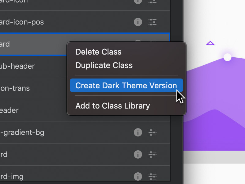
To create a dark theme version of any class, simply right click the class in the Class Manager and from the contextual menu select Create Dark Theme Version. This will create a class with the correct name so its styling values only take effect when the site is viewed in dark mode.
Preview Dark Mode
If you want to preview your sites dark theme styling, you can simulate the OS dark mode using the dark site mode option found in the canvas settings.
Quick Example
Below is a quick example that covers the process of setting the background colour of a Bloc specifically for dark mode, using all of the techniques mentioned in this post.