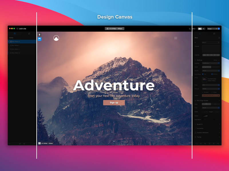
The design canvas displays the visual output of the sites that are created with Blocs. It enables users to interact with the page in real time, allowing them to select elements, move them and edit their contents. The design canvas is found in the center of the main application window sandwiched between the left and right sidebars.
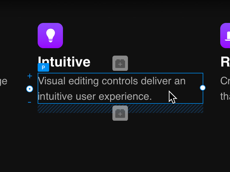
The Selection Marker
When an element is clicked on the design canvas, it will display a blue marker, this is referred to as the selection marker. Depending on the type of object that is selected, this marker may also contain some visual styling controls that let users adjust the size and position of the selected element. We refer to these as Freehand controls, you can read more about them here.
Canvas Settings
The design canvas has a range of options that let users control the visual rendering of the currently open website. These options can be found in the bottom left corner of the design canvas.
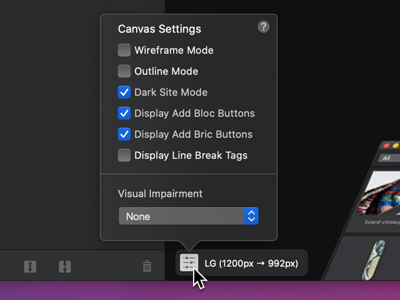
Wireframe Mode
Wireframe mode strips out all non-layout essential styling, allowing users to focus on page content and structure.
Outline Mode
Outline mode displays a thin blue rectangle around the bounding areas of all elements on the page, allowing users to view the underlying structure.
Dark Site Mode
Dark Site Mode inverts the colours of the + buttons, making them more distinguishable on dark backgrounds. It also simulates the OS dark mode and applies the dark-theme class to the body tag of the current page.
Display Add Bloc Button
Toggle the visibility of the + buttons that are used to add Blocs to a page. This option can also be toggled on and off using the keyboard shortcut ⌥+⌘+4.
Display Add Bric Button
Toggle the visibility of the + buttons that are used to add Brics to a page. This option can also be toggled on and off using the keyboard shortcut ⌥+⌘+5.
Display Line Break Tags
Line break tags <br> are not visible by default, this option lets users toggle the visual rendering of them on the design canvas.
Visual Impairment Filters
This option lets you select from various types of colour blindness filters, enabling you to see how your site would appear to a person with a visual impairment.