Flexi Filter is a powerful custom Bric that lets you add real-time content filtering to any web page, it’s easy to use and quick to setup.
How to Use
Once you’ve purchased and installed the Flexi Filter Bric, simply add the Bric to your Blocs project using the Bric Bar, assign a Group ID and then assign the same ID to each filterable item using the custom data attribute data-filter-group.
You can also filter elements by tag using the data attribute data-filter-tags.
Data Attributes
The following custom data attributes are supported when using the Flexi Filter Bric.
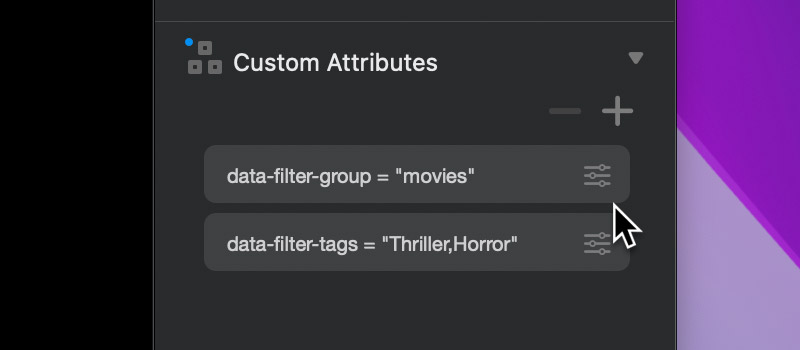
data-filter-group = The group ID that matches the Flexi Filter Bric.
data-filter-tags = The tags an element is filtered by, each tag should be separated by a comma.
Controls
Flexi Filter has a wide range of customisation options that let you tailor not only the look and layout of the filter controls, but also the style of the filtering animations.
Group ID
Use this control to set a unique ID for the current instance of Flexi Filter. The same ID should be applied to each filterable item using the data attribute data-filter-group.
Matched Items
Filter Using
This control allows you to select how results are filtered, there are three options available.
Text Content = Items are filtered based on the text content found within them (images use alt text).
Tag Attribute = Items are filtered based on the content set in the tag attribute (data-filter-tags).
Text and Tags = Items are filtered based on both text and tag attribute content.
Randomise Content
When enabled, this control randomises the order of content when a search filter is active.
Class Field
This field can be used to assign a pre-defined class to each filtered item. This enables you to customise the look and style of filtered items using a custom class.
Excluded Items
Style
This control allows you to customise the animation style of excluded items, there are five options available.
Fade = Excluded items will fade out and then become hidden.
Hide = Excluded items will instantly become hidden.
Shrink = Excluded items will shrink in size and then become hidden.
Mute = Excluded items will become semi-transparent and remain visible.
Blur = Excluded items will become blurred and remain visible.
Input Field
Shape
This control enables you to set the shape of the filter input field, there are four options available.
Start Size
This control can be used to set the initial size of the filter input field, there are three options available.
Normal = Input field is initially displayed at its full size.
Compact = Input field is initially displayed in compact mode, clicking it will cause it to expand to its full size, allowing the user to input a search query.
Hidden = The input field is hidden, this option is intended for tag cloud only filtering.
Placeholder Field
Use this field to set the input fields’ placeholder text.
Icon
Style
Use this option to set the magnifying glass icon style, there are eight to choose from.
Position
Use this option to set the display position of the icon, there are three options to choose from: left, right and hidden.
Colour
Use this option to set the colour of the magnifying glass icon.
Tag Cloud
Flexi Filter will automatically generate a tag cloud based on the contents of all data-filter-tags data attributes that are found on filterable items with a matching group ID.
Position
This control lets you set the position of the tag cloud, there are five options available.
After Field = The tag cloud is displayed after the input field on the same line.
Above Field = The tag cloud is displayed above the input field.
Before Field = The tag cloud is displayed before the input field on the same line.
Below Field = The tag cloud is displayed below the input field.
Hidden = The tag cloud is hidden and not shown.
Alignment
This control lets you set the horizontal alignment of the tags within the tag cloud.
Shape
This control lets you set the shape of the tags within the tag cloud, there are three options available.
Selection
This control allows you to customise how tag selection works, there are two options available.
Multiple = Multiple tags can be selected altering the filtered items.
Single = Only a single tag can be selected, when another tag is selected, the previously selected tag is deselected.
Show Scrollbar
This control allows you to toggle the visibility of the scrollbar on the Tag Cloud.
Tag Class
Flexi Filter allows you to further customise the style of the tags generated in the tag cloud using custom classes.
Normal Field
This field lets you set a single class that will be applied to all tags.
Selected Field
This field lets you set a single class that will be applied to all selected tags.
Dark & Light Theme
You can set the theme of the Flexi Filter input field and tag cloud by selecting the parent container of the Flexi Filter Bric and setting its Bootstrap Theme option to either dark or light. Please note this option is only available for the Bootstrap 5 framework.
Flexi Filter is available to buy at the Blocs Store.