The Accordion Bric provides a way to break down and toggle between hiding and showing large amounts of content. Accordions consist of various sub elements such as the Card Bric and Div container Bric, which enables them to be easily customised and styled independently.
Structure
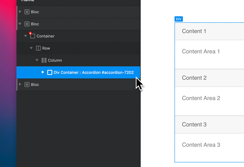
The structure of an accordion is a little more complex than most other Brics found within Blocs. It is comprised of a Div container Bric that has its Type set to an Accordion Container and its ID set to a unique value, for example accordion-17605. Within this container there are multiple Card Brics. Each card Bric has a Link Bric within the card header section and an additional Div container that contains the card body section.
Communication
The accordion Bric functions are controlled via the Link Bric (found within the header section of a card) and the Div container (that contains the card body section). Both of these items have custom data attributes applied to them in order to give them the typical accordion functionality and allow them to communicate with each other.
Accordion Link Bric
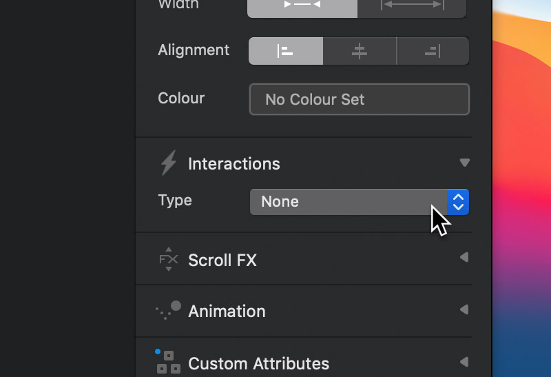
The link is the element you click to reveal the accordion section. This item has a specific set up that enables it to work as part of an accordion. It has its interaction set to none and it also has various custom data attributes, the most important two being the data-target and aria-controls.
Link Data Attributes
The data-target attribute has a value set to a unique reference, for example #accordion-17605-item-1. The aria-controls attribute contains an almost identical value to the data-target attribute, but has the # at the beginning removed, for example accordion-17605-item-1. These unique references should match the ID of the corresponding div container that the card body is nested within.
Accordion Div Container
Within each card Bric (found within the accordion main container) is an additional Div container that has its ID set to a unique value, for example accordion-17605-item-1. This ID value should correspond and match the custom data attributes, data-target and aria-controls found on the link Bric (located in the card header section).
This div container Bric also contains various custom data attributes, the most important one being data-parent. This value of this data attribute should match the ID of the main accordion container, for example #accordion-17605. This data attribute tells the browser which accordion container, this section is related to.
For more detailed information on how Accordions work, please refer to the Bootstrap 4 docs.