Introduction
The Blocs developer API allows 3rd parties to create custom Brics that can be used within the Blocs design environment. The core components of a custom Bric are created using HTML, JS and CSS (you can read more about data and file structure here). There are various API protocols that can be accessed via any javascript based language.
Please Note: the Blocs developer API is currently in its initial Alpha phase, so some features and documentation may change.
Bric Builder
Blocs comes with a developer tool called the Bric Builder that is designed to help with the development and creation of custom Brics. It can be accessed via Developer > Bric Builder in the main menu. The Bric Builder is the easiest way to get started with creating custom Brics, it’s recommended you follow this basic guide to creating your first custom Bric.
Building Interfaces
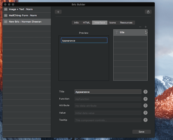
The user interface for a custom Bric should be created using the Bric Builder tool. Under the interface tab there are various fields and controls for adding and managing the user interface for your custom bric.
Adding an item
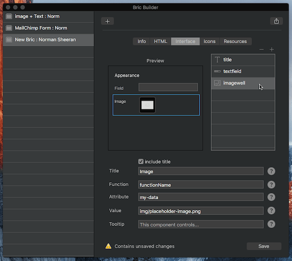
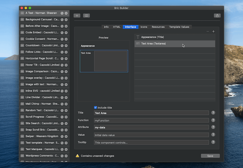
To add a new user interface component, click the + button located at the top right of the UI layer tree and select the type of interface component to add.
Reordering items
User interface items can be reordered by dragging and dropping the relevant layer in the layer tree.
Duplicating items
User interface items can be duplicated by simply Right Clicking the relevant layer in the layer tree and selecting Duplicate from the context menu.
Available UI Components
Title – A title is a visual text component that does not call a function.
Multi-Line Label – A multi-line label is a visual text component that does not call a function.
Text Field – A text field passes a string value to its allocated edit function.
Stepper Field – A text field with stepper control passes an integer value to its allocated edit function.
Text Area – A text area passes a string value to its allocated edit function.
Image Well – An image well passes a file path to its allocated edit function.
Drop Down Menu – A drop down menu passes the selected integer index and item string value to its allocated edit function.
Checkbox – A checkbox passes a bool value to its allocated edit function.
Button – A button calls its allocated edit function when it is clicked.
Font Selector – A dropdown menu that passes a font selection to its allocated edit function.
Page Selector – A dropdown menu that passes a page ID, name, attribute and the selected item integer index to its allocated edit function. Page ID’s are swapped out for actual page URLs on export as long as the ID is stored under the data attribute data-blocs-page.
ID Selector – A dropdown menu that passes an ID to its allocated edit function. This menu is populated automatically with all element ID’s from the current page.
Hype Selector – A dropdown menu that passes a hype project name to its allocated edit function. This menu is populated automatically with all .hyperesources directories added to the current project.
Color Well – A colour well passes a hex value to its allocated edit function.
Slider – A slider passes an integer value to its allocated edit function.
Horizontal Alignment Control – An align segmented control passes an integer value to its allocated edit function (0 = Left | 1 = Center | 2 = Right).
Vertical Alignment Control – An align segmented control passes an integer value to its allocated edit function (0 = Top | 1 = Middle | 2 = Bottom).
Text Alignment Control – An align segmented control passes an integer value to its allocated edit function (0 = Left | 1 = Center | 2 = Right | 3 = Justify).
Device Select Control – A device segmented control passes an integer value to its allocated edit function (1 = Desktop | 2 = Tablet | 3 = Mobile Landscape | 4 = Mobile).
Edge Select Control – An edge select segmented control passes an integer value to its allocated edit function (0 = Left | 1 = Top | 2 = Right | 3 = Bottom).
Direction Select Control – A direction segmented control passes an integer value to its allocated edit function (0 = Left | 1 = Up | 2 = Right | 3 = Down).
Divider – A divider is a visual component that does not call a function.
UI Component Data Attributes
Each user interface component has various data attributes that are used to set key interaction characteristics such as the function that is called when a component is interacted with or the tooltip that is shown when the user moves the cursor over a component.
Title – The title for the interface element. Typically displayed on the left side of the sidebar.
Function – The function name that is called when this interface element is interacted with. Only include function name, don’t include ().
Attribute – The attribute name used to store the data value for this interface element.
Value – The initial attribute data value of this interface element.
Tooltip – The tooltip text displayed when cursor is over the component.
Writing Functions
To manipulate the HTML of a custom Bric, you will first need to write your own (javascript based) editing functionality. These editing functions are intended for use within the Blocs design environment and are not used when your custom Bric is included within an exported project. These edit functions should all be placed within a single JS file that is loaded into the header of your custom Brics index.html <edit area> file. Edit functions are bound to a user interface component via the user interface components function data attribute.
When a user interface component is interacted with, it will call the designated editing function and pass a value to it along with the target attribute that value is assigned to. The data payload for the edit function will depend on the type of user interface component that is being used to call it. An edit function should be written so it declares the payload variable correctly. In the following example the edit function used by a checkbox is set to receive a BOOL payload first and the target attribute string value second.
Example:
function myCheckbox(isChecked,targetAttr)

{

if(isChecked)

{

// checkbox is checked

}

}
Debugging Custom Brics
Blocs comes with some useful features built in to help with debugging custom Brics. You can find out more about these built in debugging features for here.